Painting the Antarctic
Introduction
How do you paint the sea and
ice-bergs from the rock and roll of a large ice-strengthened cargo ship? This
is a question I have been asked many times since returning from the Antarctic. Answer, wedged between the strapped-down stool and bench.
During the summer of 2002/3 I
was fortunate enough to travel to Casey Station in the Antarctic on a
fellowship awarded by the Australian Antarctic Division. As an artist-and
writer-in-residence, I had the time of my life. This was the best studio an
artist could ever wish for. I didn’t have to go anywhere, the subject changed
every moment of the day and night and it was a long day - up to 24 hours of
daylight the deeper south we sailed.
‘You won’t need to take many
colours – only white and blue - a comment I heard repeatedly before I left
home. Wrong. With the endless daylight and crisp clarity of the atmosphere, the
landscape and sea was a kaleidoscope of brilliant colour. Imagine the purest
sky of clean cadmium yellow, vermillion, rose dior, carmine, lilac, turquoise,
cobalt, viridian, silver, paynes grey, yellow ochre, orange, naples red and
yellow, ultramarine and indigo. Imagine oil paint, watercolour, gouache,
pastels, oil and dry, unlimited sketch books and never enough film. Imagine the
clearest atmosphere and sharpest horizon, a sublime mist obscuring the same
horizon, the spread of silver light across a moody pewter sea, ice sculptures
towering like high rise buildings, or looming moodily from afar. Notice the
changing rhythms and tones of the water and the iridescent ice-blink of
reflected beneath the grey cloud. This, a taste of artist heaven experienced in
the southern ocean.
*
Good planning, for any
painting trip is essential. There was no opportunity to have a forgotten tube
of cobalt or another sketch book flown down. For months before the voyage time
was spent thinking and visualizing what I wanted to achieve and what materials
I would use. Carefully I thought through the smallest detail and every item
needed. I wrote lists for each discipline. Oil paints. Would I need
multiple tubes? White? Better to take more than was
necessary, have a back-up supply. And what if the ship was beset in ice for
week? If only! Think of all that extra painting time I would have
had! The lists ran into pages as I listed the variety of brushes I would need
for oil, acrylic, water-based paints, containers for solvents and mediums. I
listed canvas, rag paper, tapes for holding down paper to sketching board,
paint rags, bags for collecting the waste material (all of which had to be
returned to Australia). I compiled lists itemising pastels and the boxes I
would contain them in, the fixatives, rags and pastel papers. I did the same
for gouache and watercolour paints. In keeping with my usual advice for
students embarking on a plein air painting trip, I packed more - not
less. Generally, it is a good practice to take as many tools and materials you
can physically carry. Early in my field trips I was caught out many times by taking
the pared back easy option with just the basics. I was only to regret
not packing a particular medium because the subject seemed to cry out to be
executed with a particular medium. It is also good practise to approach a subject from different mediums – it can be
amazing how the same subject painted in gouache and then painted with dry
pastel can appear – each material may bring out a different ‘emotional’
response.
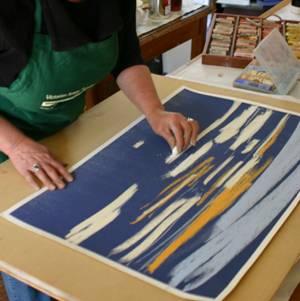
I also made a series of
sketch books using traditional bookbinding methods. I wanted to limit the
number of sketch books I would carry and vary the sizes. By making my own books
I was able to bind several types of paper into one book. By making the papers
into sketch books I was able keep the papers together as I had envisaged the
strong Antarctic winds carrying loose sheets of paper and artworks across the
ice and sea. A sheet of glassine paper was placed between each sheet of art
paper to protect the work. I didn’t want the pastel dust to contaminate a
soft watercolour image or a strong gouache sketch. The books were made using
the beautiful
As it was a field trip, where
I had planned mostly smaller sketches with the large exhibition paintings to be
later produced later in the studio, I was not concerned about my usual need for
carrying a number of medium size canvases. In fact, I did not make any oil on
canvas paintings. The only oil work I did was on rag paper from the ship. If I
had wanted to, a number of small canvases were also packed, but remained
unused.
All materials packed into one
large suitcase and the French box easel. Several days were spent packing
and repacking. I would pack the oil paints, rethink, take them out and finally
decide to pack them again. This meant I also had to carry inflammable solvents
- a problem getting from
The camera was a useful tool.
I used to shun the idea of the artist working from photographs. But, in
extreme situations such as travelling by ship and wanting to record the image
of the blue glow from within a fast-moving iceberg as the ship passed by, the way the sun momentarily peeked through a cloud
space and lit the rippling water or to capture the image of a rainbow falling
on the horizon in a pink evening sky, the camera was the best way.
There is a place for the
camera alongside the artists’ work. Some sea and landscapes are interpreted
through the lens in a finer and more beautiful and complete way than paint can
produce. I don’t believe this is due to the lack the artist’s skill but more to
the sensitivity of film or digital imagery. There is a complementary
sensitivity particular to individual mediums. This is one of the reasons I like
to pack a range of tools to capture my story and to relay what it is I am
trying to convey.
The challenge of the camera,
paint brush or pastel is to understand the image that has stirred the creative
fire. The appropriate medium that best interprets the vision should be used.
Working from the bridge of
the ship I was often able to juggle the camera and the sketch book
simultaneously. I seemed to work at a heightened energy level, continually
stirred by the evocative sea and wanting to capture everything all at once.
*
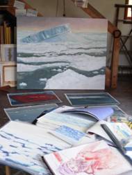
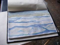
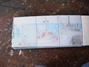
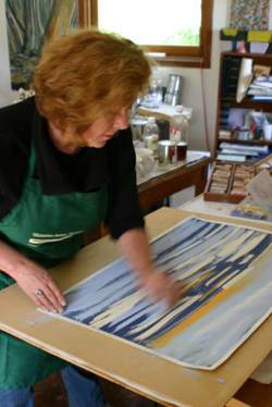
These photographs show a
number of the hand made sketch books I worked from in the Antarctic. Notice
some sheets of pastel and other books of watercolour images showing. In the background
is one of the stages of the ‘Turning Berg’ painting.
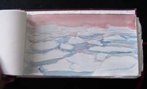
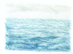
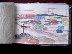
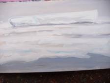
Water colour sketch painted
quickly as the ship pushed its way through the pack-ice. The sky was pink – for
hours.
This small sketch is made
using gouache and pencil.
This is a colour pencil
sketch. I am looking at the rhythm of the sea and the gentle play of light from
the sky reflected on the water.
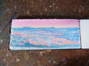
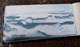
From the largest of the
sketch books, this image is painted again quickly as the ship edges through
pack-ice, avoiding sailing too close to the looming bergs.
To achieve the drawing, I
used a quick hand and large brushes. Like meditation, you need to go outside
yourself, become not conscious and let the hand follow the eye. This is a form
of intuitive painting.
I wanted to portray the
myriad colours in this
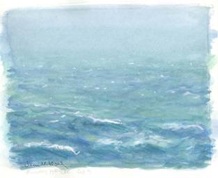
This small sketch was painted
quickly using watercolour. I tended to treat the watercolour and gouache in a
similar manner, taking the colours I needed from the two mediums. I had no
concerns about using the two mediums in the one painting.
This watercolour was painted
from the top of a rocky outcrop overlooking Casey Station. I used the smallest
paintbox I could pack one good mop brush to form both washes and fine lines.

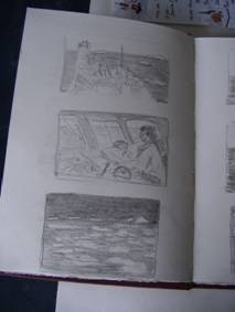
These works were routinely
painted from the bridge during the ice part of the journey. I made many
sketches in my books of this subject.
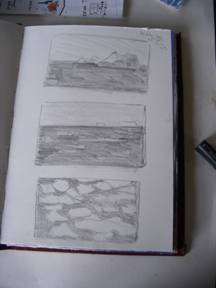
Two pencil studies – I found
I was so attracted to the ocean colours I rarely used black and white. Later,
in the studio, I made a series of etchings using only black ink.
Another
small gouache study.
These two images from the sketch
books were made on a day the sea was so rough the captain was sure I would not
be able to paint. It was difficult but I did not want a day to go by without
painting. So I made a series of whimsical images of the rock, roll and pitch of
the ship. The movement is achieved by keeping the horizon line at the same pint
in each image.
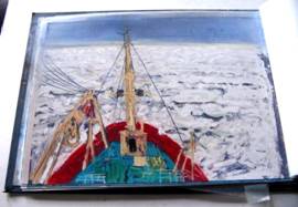 This is the view I saw from my bridge studio. I am looking across the bow of
the ship to the thickening sea ice. If we were
to become stuck, this would have been the day.
This is the view I saw from my bridge studio. I am looking across the bow of
the ship to the thickening sea ice. If we were
to become stuck, this would have been the day.
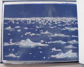 A simple sketch using only white and two blue pastels on a blue
paper. I wanted to draw the bubbly ice.
A simple sketch using only white and two blue pastels on a blue
paper. I wanted to draw the bubbly ice.
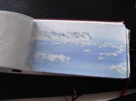
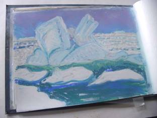 Some
of the ice-bergs were like glass sculptures. This is one of them. To pass by
them was like sailing through a crystal bath. And the sky was so beautiful with
its iridescent mauve evening glow.
Some
of the ice-bergs were like glass sculptures. This is one of them. To pass by
them was like sailing through a crystal bath. And the sky was so beautiful with
its iridescent mauve evening glow.
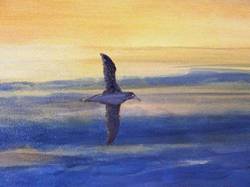
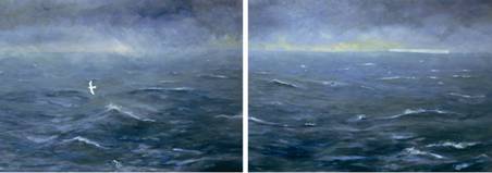
 The
Sooty Albatross seemed to bring the shadow of the night across the sea. This is
a large painting, 122 x 153 cm oil on canvas and painted from my studio using
photographic and sketch material for guidance.
The
Sooty Albatross seemed to bring the shadow of the night across the sea. This is
a large painting, 122 x 153 cm oil on canvas and painted from my studio using
photographic and sketch material for guidance.
 Detail
from ‘the Sooty Albatross’ painting above.
Detail
from ‘the Sooty Albatross’ painting above.
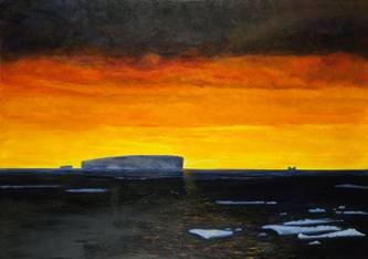 ‘The Midnight Sun’. One of the largest of
my studio paintings – 5’ x 7’. A special new years eve
gift. At exactly
‘The Midnight Sun’. One of the largest of
my studio paintings – 5’ x 7’. A special new years eve
gift. At exactly
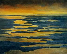
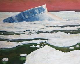 Another
studio painting, ‘Turning Berg’, it was astounding to witness large ice-bergs
‘turning’ as they dissolve into the sea. The ice in this disintegrating berg
formed many years earlier. The painting is 122 x 153 cm, oil on canvas. The
blue glow appears to emanate from within the bergs.
Another
studio painting, ‘Turning Berg’, it was astounding to witness large ice-bergs
‘turning’ as they dissolve into the sea. The ice in this disintegrating berg
formed many years earlier. The painting is 122 x 153 cm, oil on canvas. The
blue glow appears to emanate from within the bergs.
 This is the small oil sketch for a much larger painting of a ‘Jade’ berg. These
clear bergs of old compacted ice appear like surreal jewels. The dark image on
the left-hand panel portrays a seal. We would often witness wildlife that
didn’t seem to care or even bother to lift their head as we chugged by.
This is the small oil sketch for a much larger painting of a ‘Jade’ berg. These
clear bergs of old compacted ice appear like surreal jewels. The dark image on
the left-hand panel portrays a seal. We would often witness wildlife that
didn’t seem to care or even bother to lift their head as we chugged by.
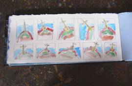
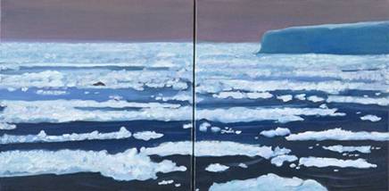
 ‘The
Messenger of the Ice’ was the first painting I made when I returned to the
studio. It is a diptych, each canvas being 122 x 153cm. The bird in the left
panel represents is the Snow Petrel which appears only near the ice. It was a
sign we were close to
‘The
Messenger of the Ice’ was the first painting I made when I returned to the
studio. It is a diptych, each canvas being 122 x 153cm. The bird in the left
panel represents is the Snow Petrel which appears only near the ice. It was a
sign we were close to
PHOTOGRAPHY
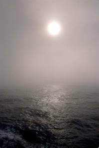
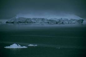
This image was typical of
many days sailing towards the ice. The sublime mood of the sea mist obscuring
the cloud created a mood where I felt I sailed off the edge of the earth. It
was hypnotic. This is an image that can only be achieved with photography. I
have painted this image with some success, but
it is then a different entity, a different artwork. This movement and light in
this photograph, for me is poetic.
For my photography I used a
canon EOS 300 SLR camera with a 28 – 200 lens and a
Ricoh digital camera with a 3.2meg file.
The photographs have been
enlarged to exhibition standard and are shown alongside the paintings.
 Another
example of an image that I think has its own life. The clarity, if attempted on
the canvas, would create I think a ‘tight’ or ‘stiff’ painting. When I have
painted this type of subject, I paint it and have the freedom of interpretation
and the nuances of the hand. I would not want to try to force paint to do what
the camera, in this instance, does so beautifully.
Another
example of an image that I think has its own life. The clarity, if attempted on
the canvas, would create I think a ‘tight’ or ‘stiff’ painting. When I have
painted this type of subject, I paint it and have the freedom of interpretation
and the nuances of the hand. I would not want to try to force paint to do what
the camera, in this instance, does so beautifully.
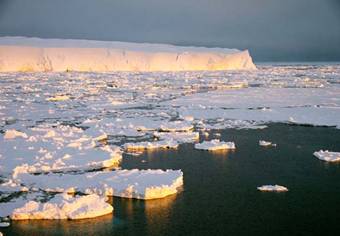
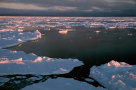
 The
reflected light falling at the bottom of the photograph on to the thick grease
ice gives a sense of the depth and coldness of the water, even through a golden
sun.
The
reflected light falling at the bottom of the photograph on to the thick grease
ice gives a sense of the depth and coldness of the water, even through a golden
sun.
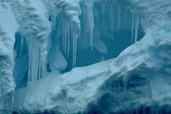 Among
some of the most memorable and exquisite images from the Antarctic I brought
home were the moments of peering into the fairy land entrances to crevasses and
ice caves. I am still processing these images in my mind before painting them.
The small paintings I have made using these subjects are, in my mind, abstract
paintings. But they don’t give that otherness or sense of unreal reality I
experience through photography.
Among
some of the most memorable and exquisite images from the Antarctic I brought
home were the moments of peering into the fairy land entrances to crevasses and
ice caves. I am still processing these images in my mind before painting them.
The small paintings I have made using these subjects are, in my mind, abstract
paintings. But they don’t give that otherness or sense of unreal reality I
experience through photography.
 Stillness. Ice frost rising from a berg trapped in a silent,
mercury sea.
Stillness. Ice frost rising from a berg trapped in a silent,
mercury sea.
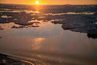
 This
photograph was taken around 2.00am Christmas eve, we
sailed into a pink dawn. The sea appeared calm and silent.
This
photograph was taken around 2.00am Christmas eve, we
sailed into a pink dawn. The sea appeared calm and silent.
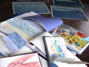
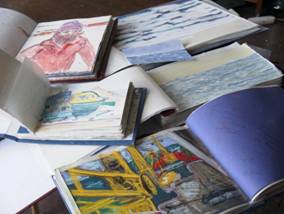
A collection of sketch books
filled during the voyage.
Paintings generously
photographed by
About Jenni Mitchell
Her first publication ‘To the
Ice: Images from the Antarctic’ is published by Line Publications and is
available from bookshops or direct from the artist, visit the web site below.
Jenni conducts painting
retreats and workshops around
Her work is represented in
many public and private collections in Australian and overseas. Forthcoming
exhibitions include the Antarctic paintings to be shown at the Hamilton
Regional Gallery throughout February and March 2005 and the Dickerson Gallery
in Melbourne, June – July 2005. More information is available from: www.jennimitchell.com.au.
published Australian Artist, February edition 2005